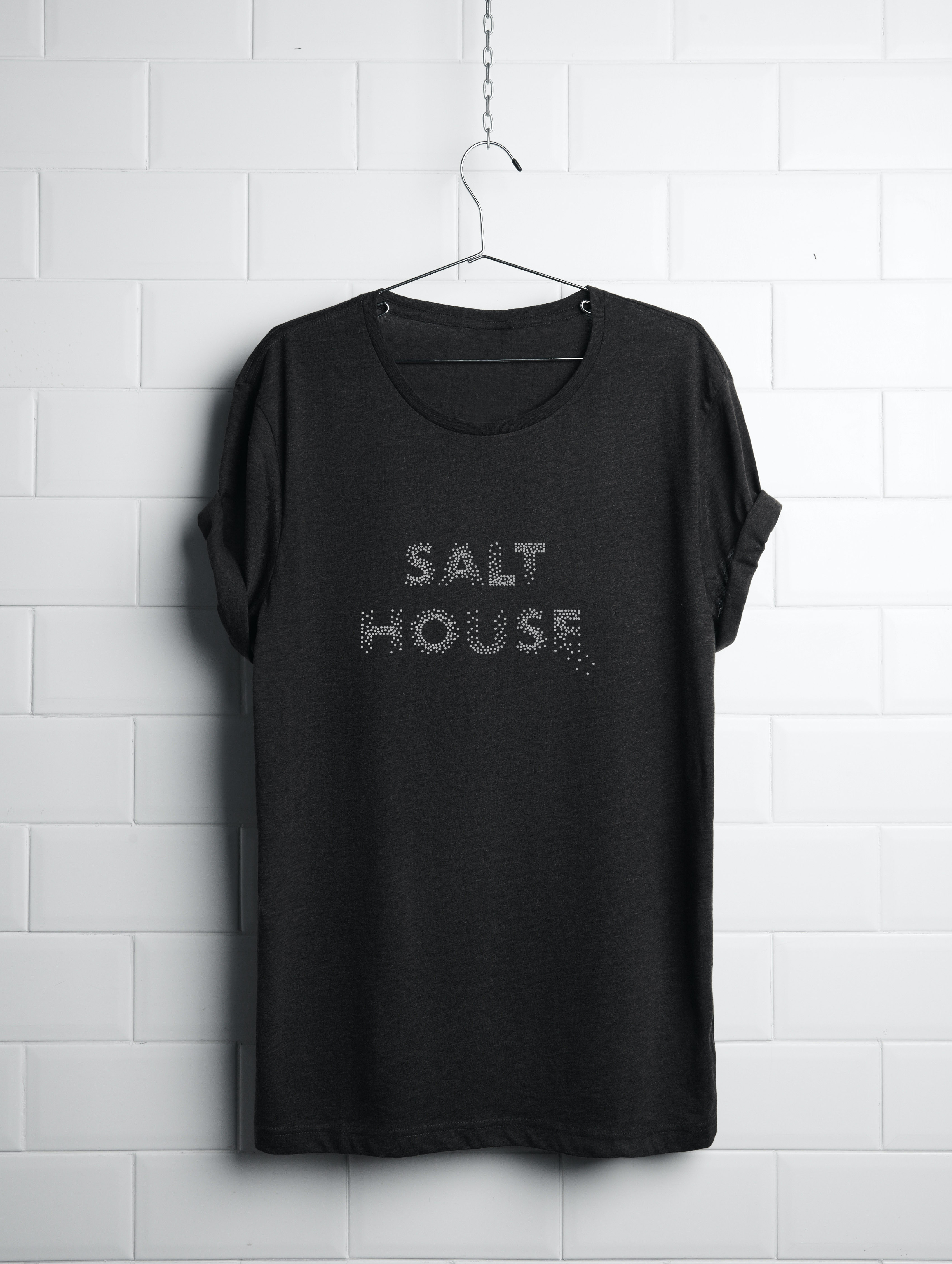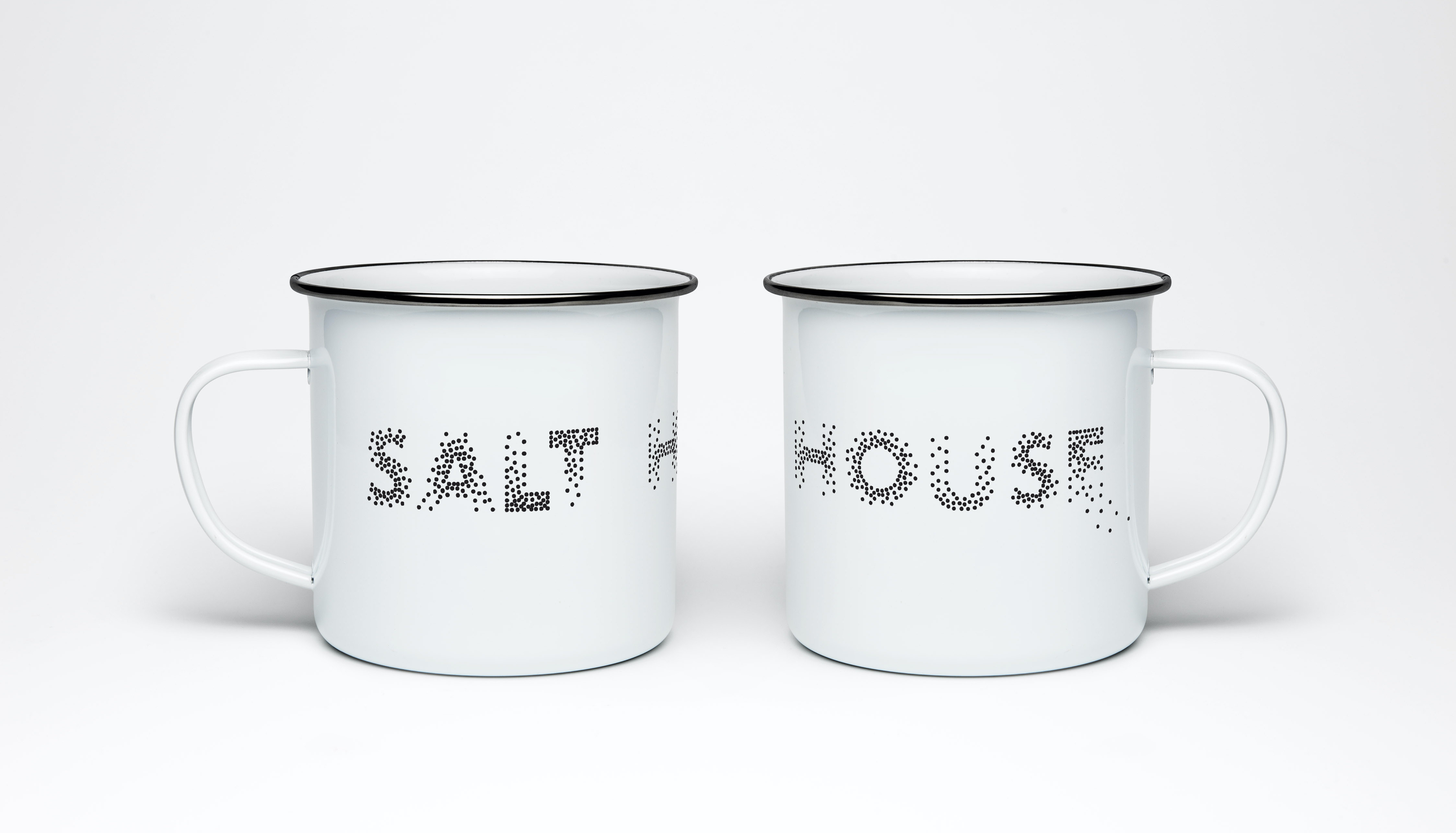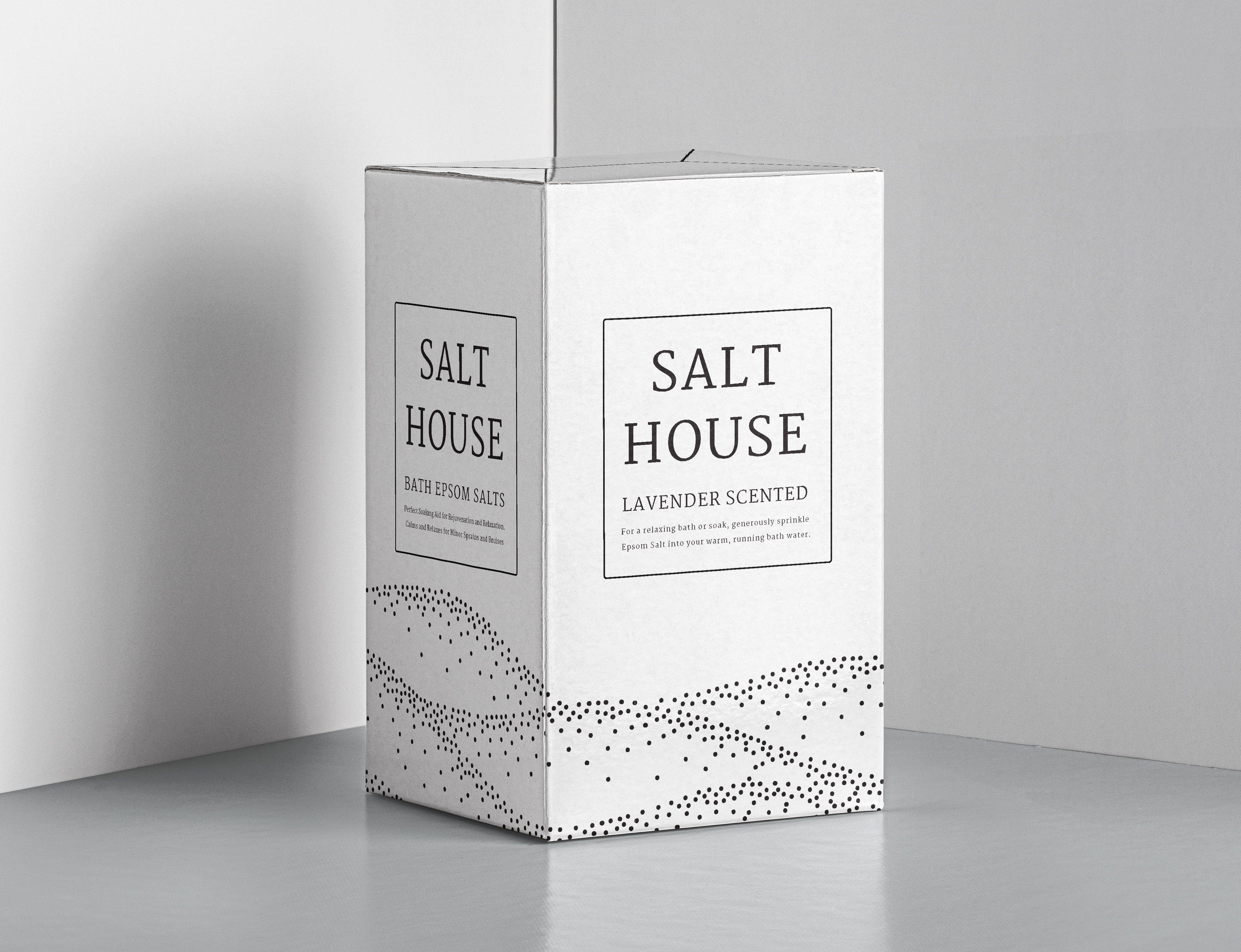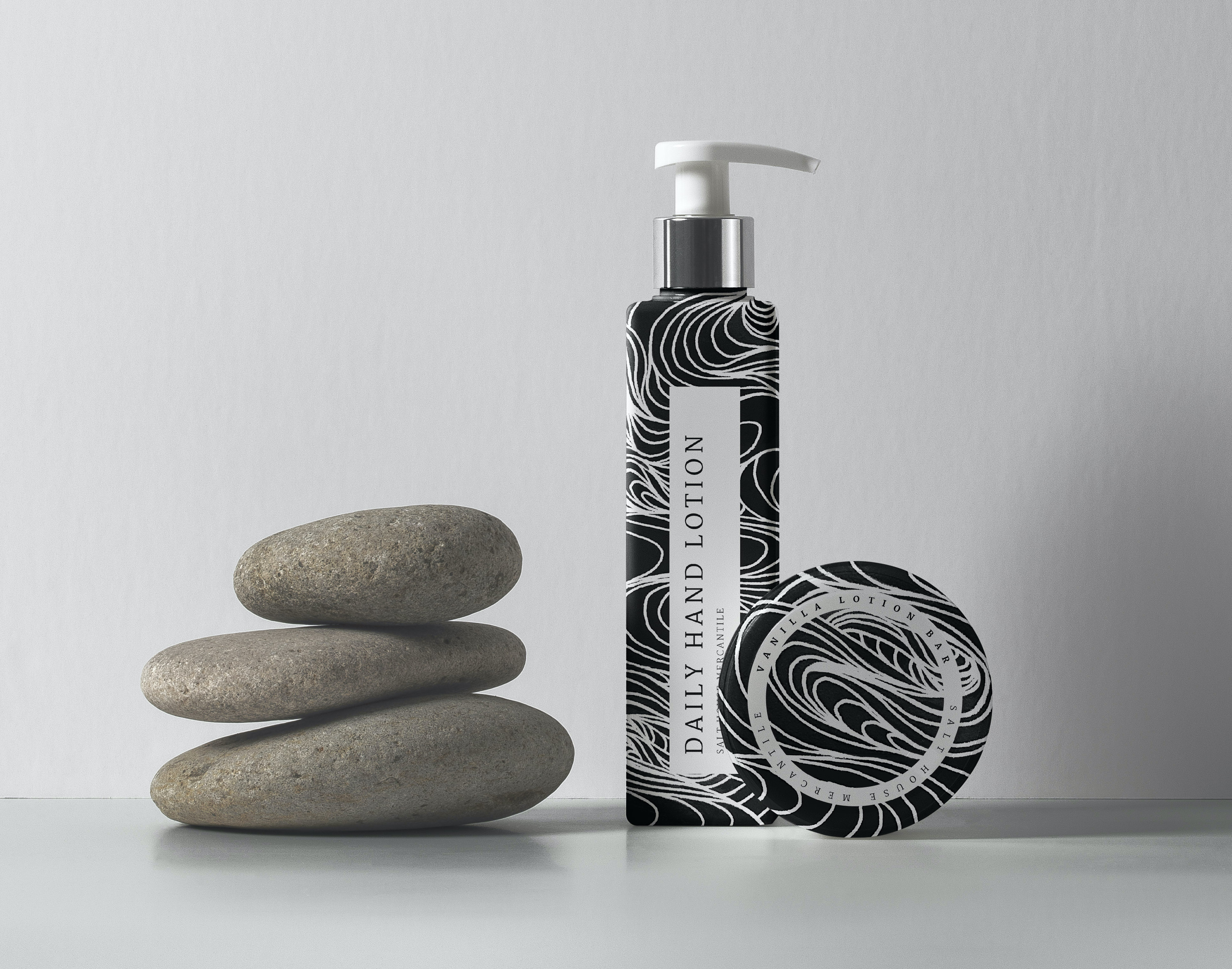
Salt House Mercantile
The Salt House Mercantile is a boutique from Bainbridge Island filled with things for the home. Its audience is very much for middle-class women looking for bougie farmhouse-themed items to spruce up their kitchen, bathroom, living room, etc. It is the kind of store where you want to buy everything as soon as you walk in but can only afford one or two items.